“Steel City Sounds” Brochure
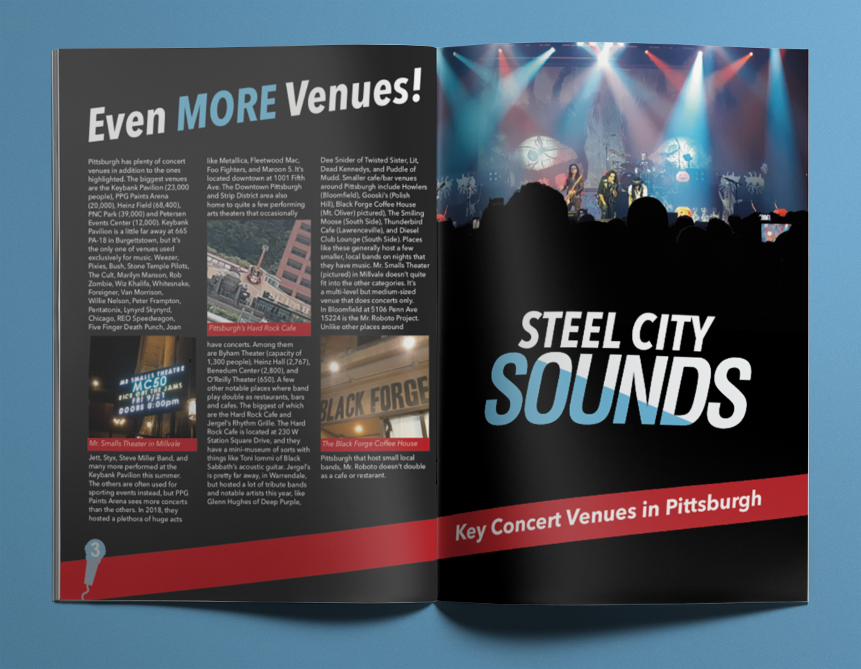
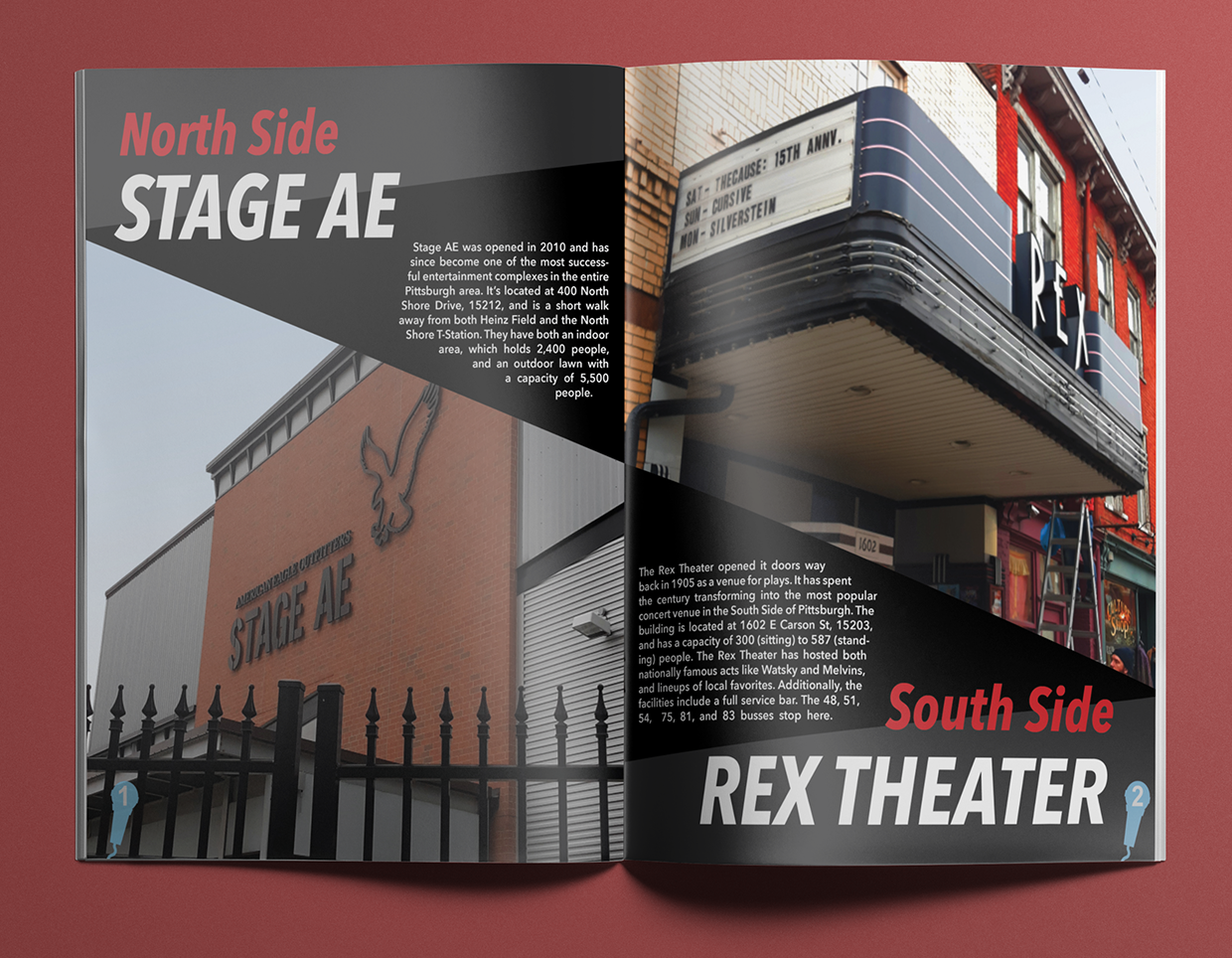
For the Graphic Design II course I took in 2018, we were tasked with making a 4 panel brochure about a topic of our choosing. Our professor wanted us to only use photos we took and write the copy rather than use dummy text. I chose to make mine about some of the concert venues in Pittsburgh since it was something I already had some pictures and knowledgeable about. The red and blue color scheme was chosen from the cover photo I took at an Alice Cooper concert at Stage AE.
“The Most Smash for Your Buck” Spread
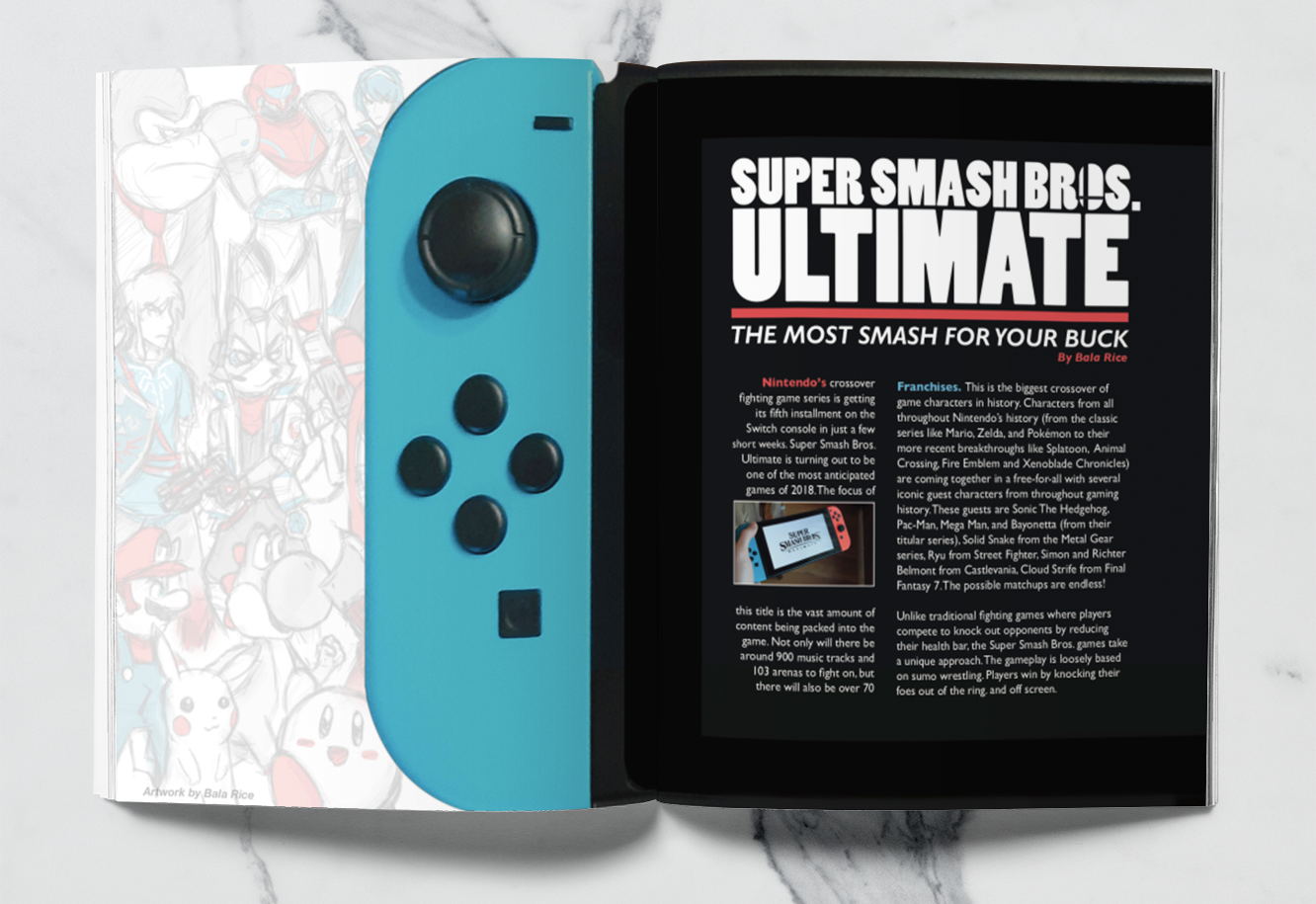
Another assignment from the Graphic Design II course was to make a creative 2-page magazine spread that resemble the opening to a longer article. Mine was about the 2018 crossover fighting game Super Smash Bros. Ultimate on Nintendo Switch. I made the text appear on the screen of the Switch tablet and had the page fold be on the part where the blue Joycon controller detaches from screen. On the right page are illustrations I made of a handful of fighters from Super Smash Bros. The series’ logo is a circle with 2 crossed lines intersecting in the bottom right corner. I used this on the “O” of “BROS.” and shaped the text boxes like the logo.
“Steel City Sounds” Brochure
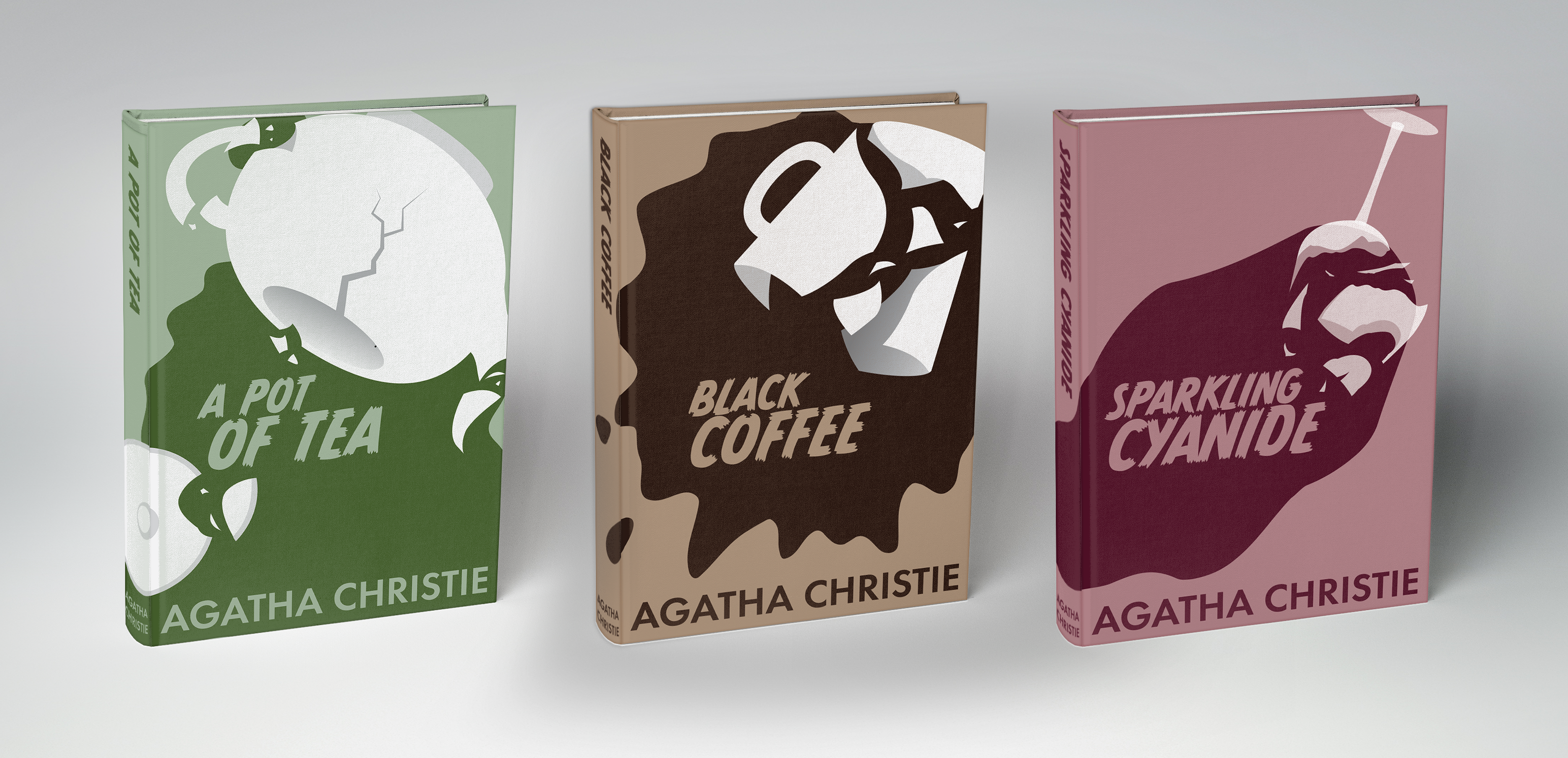
In my 2019 Graphic Design Illustration course, we were tasked with designing a set of 3 book covers by Agatha Christie or Ernest Hemingway with a unified appearance. After browsing through Christie’s body of work, I found 3 titles novels named after drinks that were poisoned in a murder mystery. On each book, I had distinct cups all shattering and spilling liquid in the same spot but with different pools of liquid and breakage pieces.

